The goal of every business owner is to attract potential customers, not turn them away. To better achieve that goal, the FedEx Office created surveys through Ketchum Global Research & Analytics to better understand what drove consumers into a store and what drove them away. Seventy-Six percent of consumers said that they entered a store or business based on the outdoor signage alone, but at the same time, 50% of consumers said that they decided not to enter a store because something was wrong with the signage.
Signage issues that drove customers included that the sign was dirty or that it featured misspelled words. These results show the importance of ensuring your outdoor signage avoids design mistakes to avoid putting off customers. Our team has identified the 3 most common design mistakes so you can make sure to avoid them.
1. The Outdoor Sign Has No Clear Goal
Once you start brainstorming what to put on your sign, getting too excited and going overboard is easy. However, too many ideas in one sign can make it look too busy or muddied. This can distract the eye, making it really hard to look at and leaving consumers confused. It may also be unclear what the sign is urging the customer to do. To avoid this, be sure to identify the purpose of your sign before you start and keep the design simple.
2. The Sign Is the Wrong Type For Its Intended Purpose
Different types of signage have different purposes. For example, a banner does not make a great permanent sign for your building because it can give your business an overall cheap feel. To help you make the best choice about which sign to use for each purpose, here are the different types of signage options and their intended purposes:
- Pylon Signs
- These are typically lighted from the back and are intended for use in strip malls and shopping centers where there are multiple business names in the same area.
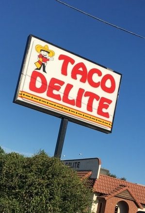
- Pole Signs
- These signs are designed to be seen from a distance which makes them perfect for grabbing the attention of consumers who are driving by. They often make use of a single, double, or concrete block/archway.
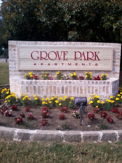
- Monument Signs
- This type of sign is perfect for offices, apartment complexes, city borders, or community centers. They are secured into the ground and displayed near the entrance of the building/area, typically standing anywhere from 3 to 8 feet high. They can also be cut into different shapes depending on the theme of the property.
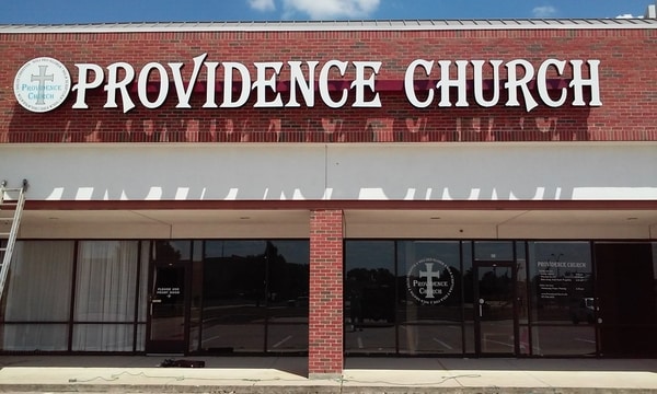
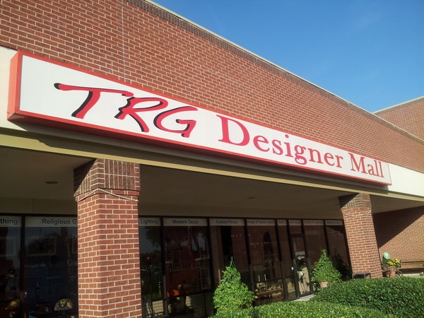
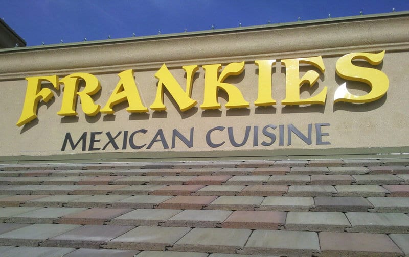
- Channel Letters
- These signs are the large 3D letters that can be seen outside of a building, displaying the company’s name or logo. They can be made any color and customized to the font that you want which makes them perfect for a unique permanent outdoor sign to show the entrance to your building.
- Billboards
- Billboards are designed to be placed on roadsides to grab the attention of those passing by. Lights can be added to ensure that they are seen at night time.
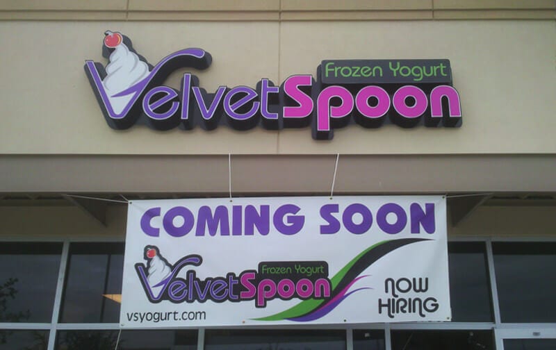
- Banners
3. There Is No Use of Contrast
Signs that are all one color or one shade will typically be boring, monotone, and forgettable. You want the colors in the background and the foreground to stand out from each other, making the sign easier to read. A lack of contrast will make it difficult for customers to decipher what exactly the sign is saying, which decreases the chances that they will both understand and follow the sign to your business. To avoid this, make sure to use high contrast colors and designs that also complement each other well.
Remarkable and Unforgettable Signs for Your Business
Your sign is one of the first things customers will think of when they think of you, so it’s important to make sure that it makes a great lasting impression. Our skilled team at Signs by Randy will work with you to make sure that your sign is remarkable, unforgettable, and representative of your business. With our years of experience and extensive knowledge, we can ensure that your sign will only pull customers in. Contact us today to schedule a consultation!

 See More Examples Of Our Work