The storefront sign is one of the most important parts of your building. It introduces your business to potential clients and entices them through the doors. The sign’s lettering needs to be noticeable and easy to read from a distance. What kind of font will help your business stand out from the crowd? What height should it be? Let us guide you through the wonderful world of fonts and font sizing.
Font Groupings
When it comes to font types, you have several options from which to choose. Serif, sans serif, and script fonts are the three main font groupings commonly used for signs. Which one should you pick? The expert design team at Signs by Randy has a few pointers:
Serif
Serif fonts have footers which are the little horizontal marks at the bottom and strokes in letters, e.g., Times New Roman. All of the fancy tails at the end and legs of the letter are flourished, helping them stand out.
Sans Serif
Sans Serif fonts are like serif except they omit the flourish of the footers, e.g., Arial. Instead, the letter strokes straight down, making them easy to read and distinguish, especially on digital platforms.
Connecting Reality With Digital
If your business has both a strong store and digital presence, consider font pairings. Font pairings are two types of fonts that work well with each other and help keep your business looking unique without being too distracting or visually obnoxious. For example, if you own a bakery that has a strong online presence for online ordering, your clientele may be looking both on the internet and coming into your store. You want your storefront sign to acknowledge both types of your consumers as, odds are, you are going to have your store logo on your website.
Serif and sans serif work well together and complement each other. Consider using a serif font for your logo and sign and a sans serif for the content on your website. It pleases the eye and will create a uniform look to make your business memorable.
Script Fonts
Script fonts look elegant and beautiful, but they present a challenge. They imitate cursive writing as the letters are tied together. If not the correct height or they are too flourished, the letters become muddled together and extremely difficult to read. For consumers who are driving by, odds are their eyes will skip over a script font that is not done correctly.
Font Sizing
 How big should the font size of my sign be? This question all comes down to how far you want your store sign to be viewed. Typically, it is recommended that for every 10 feet at which someone will be viewing your sign, you will want to increase the letter sign by 1 inch. If you are located off of the interstate and want your store sign to be viewed from 240 feet away, the letter size has to be at least 24 inches tall.
Font Sizing Chart
To better help business owners make informed decisions about font sizing for their signs, we have compiled this sizing guide:
|
Sign Type |
Distance Viewed |
Size of Font |
|
Yard Signs |
50-70 feet |
5-7 inches |
|
Roadside Signs |
60-120 feet |
6-12 inches |
|
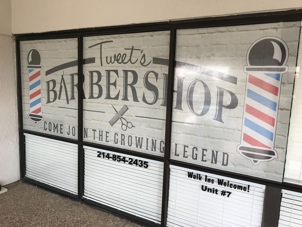
Window Display/Decals |
80-120 feet |
8-12 inches |
|
Event Signs |
120-240 feet |
12-24 inches |
|
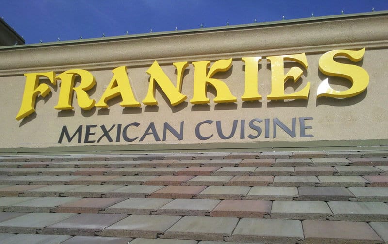
Storefront Signs |
240-480 feet |
24-48 inches |
|
Directional Signs |
100-140 feet |
10-14 inches |
Readable Signs, Exceptional Designs, Amazing Prices
Signs By Randy was started on a passion for art and a love for the sign-making industry. Our team is driven to help businesses show their pride through their storefront and outdoor signs. Creating a look that not only looks remarkable but can be read from far away can be intimidating, but your team at Signs By Randy is ready to help! Contact us today to schedule a consultation with our design team and let us help you take your business to new heights.

 See More Examples Of Our Work