
Your storefront sign should leave a lasting impression. When customers recommend your store to their friends, they’re likely using your storefront sign as one of the main identifiers. It’s imperative that your storefront sign is memorable and eye-catching. Here are 5 guidelines you can follow to make sure that’s the case.
1. Make Sure Your Font Is Legible
People should be able to easily read your storefront sign; if they aren’t familiar with your store already, they’re unlikely to invest extra work in trying to decipher an illegible script. Even if they do already know your store, you shouldn’t be asking your customers to do extra work to engage with your business. Most importantly, your storefront sign does double duty as advertising to the surrounding locale. To make the most of that function, it should be recognizable and easy to decipher from a distance.
One specific guideline is to avoid elaborate cursive fonts. While they are pretty, they are extremely hard to read, especially from distances. You should also avoid using all capital letters. Capital letters can actually look smashed together when read from far away. Lowercase letters help break things up, making it easier on the eyes and to read from farther away. Finally, leave space between words and images so they don’t blend together.
2. Be Mindful About Your Color Choices
Colors have different meanings, and the color you choose for your sign sends a permanent message to potential customers. For example, the color red stimulates your body, raising blood pressure and heart rate. This helps generate a sense of urgency or need which is really helpful in sales. Blue gives a sense of peace, security, and reliability. It’s a great color to use with brands that are more reserved or if you are trying to promote trust. Lastly, green is a very relaxing and rejuvenating color which makes it great for promoting products related to the environment or health.
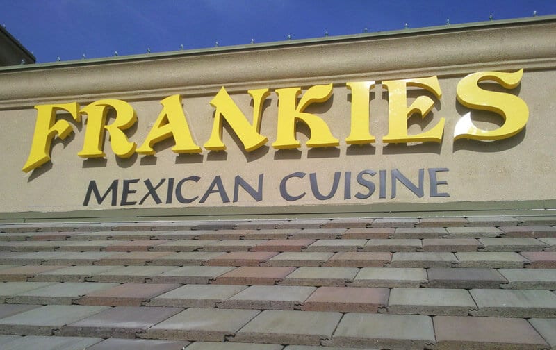
3. Contrast Makes Your Sign Stand Out
Contrast makes your sign visually striking and also makes it easier to read. To create contrast, avoid using colors that are close together on the color wheel, such as white and cream or blue and navy. Putting a border around your text can also help it stand out.
4. Size Matters
You want your storefront sign to stand out and be legible from both the front door and the street. A good rule of thumb for lettering size is that each additional inch of letter height adds about 10 feet to the radius of legibility. What that means is 1-inch high text is only easily legible from a foot away, but letters that are 20 inches high can be read from 200 feet away, a drastic increase in viewing distance that can help make sure your store reaches as much of the greater community as possible.
5. Be Representative of Your Business’s Style and Purpose
Signs need to grab people’s attention. For example, if you own a law firm, you don’t want playful lettering. On the other hand, a gym might do well with more playful lettering and colors, in order to help motivate potential customers. Matching your sign to your business enhances its impression to potential customers.
Your Perfect Sign Is a Phone Call Away
If you’re not ready to delve into the specifics of color theory and graphic design, our expert team at Signs by Randy is ready to help you craft an impactful storefront sign that will leave a positive impression on everyone who sees it. The sooner you call us, the sooner we can set you up with the sign of your dreams, so call Signs by Randy today!


 See More Examples Of Our Work