Staring at a blank canvas can be intimidating. It can be difficult deciding where to start when it comes to filing so much empty space. This is especially true if you’re trying out a new format. Here are 6 helpful guidelines to keep in mind when designing a retractable banner:
1. The Logo Should Be at the Top and Clearly Visible
The first place individuals look when they see a banner is the top. That makes the top the perfect place for your company’s logo. This way, customers will know what they’re looking at right away. To be even more effective, place the main message right below the logo. This will allow the eye to naturally flow through the important information as individuals walk by.
2. Text Should Go From Top-to-Bottom and Left-to-Right
The layout of information should flow in the direction that people naturally read. In English, that means left to right and top to bottom (just like you’re doing right now). Make sure you only include relevant information and stay concise. You only have a few seconds to make an impact and every extra second it takes to read decreases the chances that potential clients will put in the work to understand your banner.
3. Use High-Quality Images
Make sure you are using high-quality photos for your banner. If the resolution is too low, your images can come out looking pixelated, unappealing, and, in extreme cases, unrecognizable. If you’re unsure if the photo you want to choose has the requisite resolution, you can always talk to our design team about what size images you should be using before committing to printing it on your banner.
4. Colors Are Your Friend
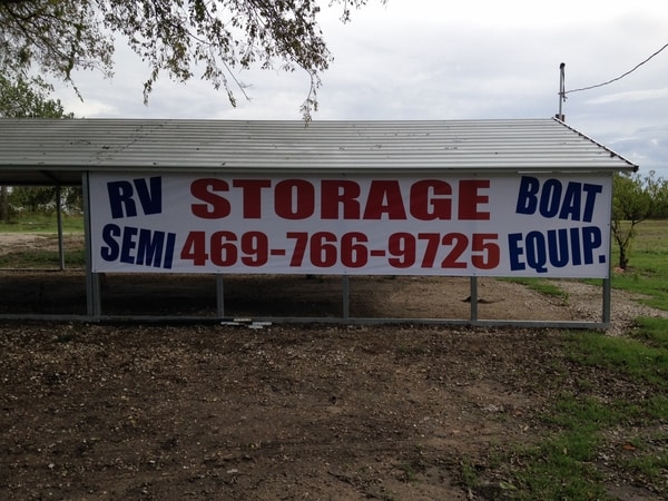
While black and white is a classic aesthetic, when it comes to signs, it is not the most memorable or eye-catching color palette. With certain font and graphic choices, it can even look wildly outdated. Colors can make your banner stand out and bring a sense of sophistication. To accomplish this effect, make sure to use colors that go well together with each other and with your logo. Additionally, consider the different meanings colors have when making this choice. For instance, black and gray convey a sense of seriousness while bright colors such as red and yellow are exciting and attention-grabbing.
5. Find the Ideal Spacing
Too much text or too many small images can confuse the eye. Make sure to leave enough open space to give the eye rest as it moves between information. Ample spacing will also help keep ideas clear and separate; for example, without appropriate spacing, potential clients may read the logo and the main message together which may not make sense to them. Proper spacing demonstrates they are different but related ideas. Negative space doesn’t have to be negative; in fact, it is an excellent way to make sure that the focus remains on the important things.
6. Consult Signage and Graphic Design Experts
If you are having a hard time figuring out what counts as proper spacing and picking colors according to color theory, don’t despair. The best way to make sure you end up with a retractable banner that suits your purposes is by consulting the experts at Signs by Randy. The sooner you get your retractable banner up, the sooner you can get the word out about your business, so make sure to give us a call today!
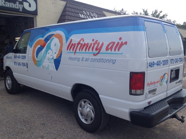
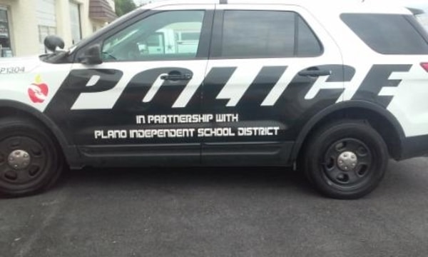

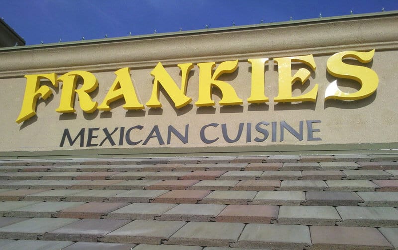
 See More Examples Of Our Work